Not quite there yet? You might want to start with my Build A Website page and then return here. Obviously, you are interested, and that page will introduce a viable option for building a free website that you can have up and live within the hour.
The Choice is WordPress
WordPress is a software package that can be used to create a blog or a highly functional, multi-faceted website. This platform has evolved over the years into a complete Content Management System (CMS). With all of its features and capabilities, WordPress is priceless and yet it is free to use.
WordPress is currently the most widely used CMS on the web. I’ve created my site with WordPress. It gives me enormous comfort to know that major organizations such as Forbes, the New York Times, CNN, and WSJ Magazine have made a similar choice. There are thousands of WordPress themes and plug-ins available that allow you to create virtually anything you might want on your site.
Why is Website Design So Important to Your Online Business?
A good website design is critical to attracting new readers, building credibility, and ultimately converting leads. Your website is the mechanism for communicating with your prospective customers. If it’s not an effective communication tool, you will undoubtedly lose customers. You have approximately 4 – 6 seconds to make a good impression. No pressure here 🙂
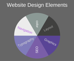
The concept of website design encompasses some important factors including navigation, color, typography, layout, overall graphical appearance and Search Engine Optimization (SEO) features. Let’s take a closer look at each of these variables as I share some of my favorite tips.
Website Design Elements
Navigation
Navigation relates to usability or ease of use. It’s analogous to a roadmap that enables users to find all of your relevant content. You want visitors to be able to readily access all of the helpful content on your site because, at the end of the day, it’s all about content! I’ve frequently read the following tip:
Site navigation should be clear enough such that your grandma could navigate easily. Now that I’ve become my grandma, I’m a true believer 🙂
I’ve recently restructured my site with Categories. Between the main menu and the category list, every piece of content is accessible from each page and post. Simple, straightforward navigation provides the best user experience (UX). An easy to navigate site builds trust with your visitors. It communicates an openness and willingness to share all the information readers may need.
Color
There are some interesting theories on website color palette choices. You’re striving for something aesthetically appealing and your color scheme is an area where “less may be more”. In general, you want to choose perhaps two to three main colors with an accent color.
The psychology of color is also quite fascinating. Not science, but intriguing nonetheless. You may want to select colors that are believed to evoke certain emotions. For example, blue is a color that evokes trust and security.
Here’s an interesting video that may provide food for thought in making your color palette decision.
Layout
Conventional wisdom holds that a web page should have a clean, uncluttered look and feel with a white background and white space between components. This design creates a calm, organized feel that tends to engender trust. Conversely, a sloppy, disorganized, or too busy design can fill a visitor with doubt or mistrust.
Layout choices abound with WordPress as there are thousands of theme options many of which are free, Some themes are more easily customized than others. So you will want to consider this aspect when selecting the optimum theme for your online business. Perhaps most importantly, you want to choose a responsive theme. A responsive theme automatically adjusts and reformats for mobile devices like iphones or ipads. Responsiveness is vital, and a key Google concern, because close to 50% of website traffic comes from a mobile device.
Typography
In choosing the typography or font styles for your website, ease of text readability is the key factor. While many font styles are available, you should generally limit fonts to two or three variations at most to prevent that “too busy look”. Font style is often an inherent component of your theme and may not be able to be changed. That is the case with my theme.
From a readability perspective, black text on a white background is easiest on the eye. Adding a bit of color to headings may draw attention to them and improve readers ability to scan the page. Scannability provides an improved UX because most visitors will not read the entire post but will search out key nuggets of information.
SEO
SEO is a huge consideration in website design. Niche websites, such as my own, rely heavily on organic traffic from search engines. Survival depends on upon keeping Google happy! Among the vast plug-ins available for WordPress, there are some excellent SEO tools. I use All-In-One for SEO. You may be interested in additional Search Engine Optimization tips.
Overall Graphical Appearance
There is no doubt about it. Most people are visual by nature. Your website must include graphical components to keep readers engaged. That said, all elements of content, both textual and visual should be relevant to the topic at hand. It seems that readers ignore graphic elements that are purely aesthetic in nature. So those images may be a waste of valuable time.
In Summary
The various elements of design discussed in How to Design a WordPress Website can have far-reaching implications for the success of your online business.
If you have a favorite website design element, please post it in the comment section below!
If you found this article helpful, feel free to share it on your favorite social media platform.
To your success!


Great informative post.
very clear and easy to read.
I am not a retiree but nonetheless I found it very useful.
I especially like your insight regarding colour and colour theory.
very interesting and true.
Colours and theme is what catchs the eye and keeps people on your page long enough to read clearly.
Hi Nae,
Thanks so much for the great comments and kind words. I have to admit, I’m fascinated with the psychology of colors myself. I’m so glad to read you found the post helpful.
From what I’ve heard, WordPress is the best website content management system available in terms of search engine optimization, and I hope that’s the case because it’s what I personally use. And as far as site design goes, there are a ton of options available, even with free templates.
Site design can make a huge impact on visitor engagement, so it’s vital that menus, colors, and the way content is presented is all optimized for conversion. What would you recommend colors-wise for a logo in order to convey a feeling of trust and legitimacy from website to visitor?
Hi Matthew,
Thanks so much for sharing your comments. It’s true that web design is a major factor in visitor engagement. So if you buy into the prevailing thoughts on color psychology (I’m intrigued but somewhat skeptical), the color most often identified with trust and security feelings is blue. There are certainly a large number of major companies that have selected that color for their image. I hope this helps and thanks for visiting my site.
What an informative post. Design counts for a lot! You speak about color psychology and I love the fact that you’ve included this in your post. I’ve been doing research about this over the past few months and color can actually motivate readers to certain actions like signing up to newsletters. If you choose the wrong color you may hurt your conversion rate. Thanks again.
Hi Celeste,
Yes, it seems that color can be a very influential factor in website design. Thanks very much for adding your excellent design comments to my site. Good luck with your own website!