
Does your website provide a positive experience for your readers or does it encourage visitors to bail? Learning how to improve website user experience (UX) can make a huge difference in the success of any online business. A better UX can drastically reduce your bounce rate and encourage return visitors.
Your objective is a pleasant and enjoyable experience that draws people in and encourages them to dig deep into your valuable content and hopefully make a purchase. But creating a great UX has its challenges because ultimately it’s very subjective and is influenced by an individual’s emotions and perceptions.
What is Website User Experience?
Finding a complete and comprehensive definition of website user experience that everyone agreed on proved impossible. Did I mention it’s subjective? 
Here’s an interesting article from All About UX that includes a list of 27 different definitions. Feel free to pick your favorite.
That said, several high-level goals seem to be key. To be successful, we want to ensure our website is:
- attractive and easy on the eyes;
- accessible;
- easy to use; and
- efficient.
With those overarching factors in mind, some best practices have evolved and gained broad support. Having an understanding of what makes a user-friendly site is useful for any website owner. It doesn’t matter whether you’re just starting out or if you’ve been on this online journey for a while.
New webmasters can ideally incorporate these suggestions from the outset. Existing websites can be tweaked if your current bounce rate is higher than you’d like it to be or if you’re seeking more conversions. We’re all looking for a few more of those conversions, right?
As website owners, we very much want to make a good impression right out of the shoot because if we don’t, we’ll lose that viewer. They’ll be off to try our competitors.
The Challenge of the Eight-Second Attention Span
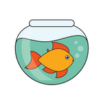
Based on a 2015 study, Statistic Brain Research Institute reports that the average attention span for humans is now 8.25 seconds. You may find it interesting and humorous to note that goldfish have a longer attention span than most of us humans.
For me, those stats really drive home the critical need to evaluate how my website stacks up against recommended tips for a great website design and UX. We have to entice readers immediately and keep them engaged.
So let’s review some of the elements that are generally recognized as providing an exceptional website experience. Answer the following questions about your site’s design to get essential insights about your UX.
12 Questions You Should Ask To Improve the User Experience on Your Website
(1) Do you have enough white space?
Make sure your site doesn’t suffer from “page clutter.” The consensus is that less is more when designing a web page. A lot of strategic white space can make your headlines and images pop. It seems visitors need breathing space, so they don’t feel overwhelmed by your content.
(2) Have you chosen images wisely?
If we can believe this Business 2 Community article, the human brain processes images 60,000 times faster than it handles text. And it’s far more accustomed to processing images. We’re a visual species from birth by nature. So, the moral of that story is make it visual!
(3) Is your font easy to read?
Courtesy of Google, we have hundreds of font choices to select from. But they’re not all legible or easy on the reader’s eye. Studies show than a black, sans-serif font on a white background works best on the Web. And don’t be afraid to increase the size. A font size of 16 reduces eye strain.
Are viewers squinting to read your text?
(4) Do you have a simple color palette?
Choosing 2 or 3 primary colors appears to be a solid decision. There’s a large body of research on color psychology and how colors influence your audience. Based on your demographics, you may want to re-think your color palette. Color is an influential factor for many brands.
(5) Is your navigation bar easy to find and use?
People are on your website to learn something new, find answers to questions, or perhaps be entertained. What they don’t want and probably won’t tolerate is a hassle to find what they’re looking for. Give them a roadmap and make it easy for them to explore!
I was on a site the other day, and I couldn’t figure out how to get to their blog roll. Nothing on the menu bar said “blog” or “home.” Really? I clicked every option on the navigation bar without success before I gave up in frustration.
Don’t frustrate your visitors! Make everything obvious!
(6) Have you added value with links?
Links are an important aspect of the user experience because they direct readers to additional, related information. Make it easy for your visitors to find exactly what they want in the quickest manner possible. Links encourage browsing and multiple page views which will keep people on your site longer.
(7) Do you have definitive Calls-to-Action?
Readers should never be in doubt as to what steps you want them to take next. Your CTAs should be prominent and encourage the desired action. Do your CTAs stand out?
(8) Have you categorized your content?
Categories can help immensely with the flow and organization of content on your site. If a reader is on a mission and focused on one topic, the ability to select that specific category and see all posts on the subject is perfect.
(9) Are comments enabled to encourage engagement?
Comments draw people in and create a feeling of involvement. They create a forum for asking questions, expressing opinions, and providing feedback. Listening to the feedback can be beneficial because it’s an opportunity to make changes for the betterment of your business.
Feedback is invaluable particularly when it’s hard to hear!
(10) Have you checked for mobile optimization?
Since 2014, the number of global users accessing the Internet from mobile devices has exceeded the number of desktop users. So, if we want more visitors, it seems obvious what we need to do.
(11) Do you have a search box?
Readers like to cut to the chase and find what they need as quickly as possible. Search boxes help them get answers faster.
(12) How does your footer look?
Your footer can be one last chance to hammer home key elements of your message. If someone has scrolled to the bottom of the page, you may also want to provide navigation so they can easily travel back and view another page or post. Is your footer useful in keeping people on your site longer?
 12 Questions You Should Ask to Improve the UX on Your Website
Never Forget That Content Trumps All
An outstanding website design and UX serves to enhance the quality content on your website. It can have an enormous impact because a poor design may prevent folks from ever hanging around long enough to actually read all the great stuff you’ve written.
But the UX is just an enhancement. A sleek design can’t compensate for poor quality content.
Wrapping Up
We put a lot of time and effort into creating out websites, don’t we? Let’s make it worthwhile by creating the best possible UX for our readers. I hope you’ll use this list of pointers do perform an honest, objective assessment of your site. Get some feedback on these items from a friend or two.
Then, go forth and improve your UX!
You don’t necessarily have to give your site a complete makeover to see significant improvements. Many of the tips above can be implemented or tweaked individually in a few minutes. Over time small improvements can add up and make a difference.
Over To You
Were my tips on how to improve website user experience helpful to you? What did you decide to tweak on your site? We’d love to hear from you in the comment section below!
Like It? Please Share It!
The best way to improve your user experience is to start making your readers laugh.
I created a blog recently and I decided that I was going to make all my content really funny and I can tell that my audience really appreciates the laughs that I give them.
They are usually more likely to want to finish reading all of your content if you keep it interesting.
Here is a good tip for anyone who is new to blogging. Conversational style writing is the new wave. Most top dogs are writing in a conversational way and readers love it!
Ultimately I’m saying to spice up your writing as much as you can.
Hi Tomas,
Thanks for chiming in. You make a great point that a conversational tone is an excellent way to increase engagement and help readers feel as though you’re chatting with them directly. I’m not sure all content lends itself to being “really funny” but I would agree that introducing a bit of humor where you can is a super way to connect with folks. It sounds like you’ve found your blogging “voice”. Good luck!
Great with the list of the 12 questions to ask myself about my website to get an idea about the user experience.
It made me take a look at my footer and add a search bar, as I have so far not thought about that.
Interesting with the short attention span for human beings. I actually thought it might be even shorter than 8 seconds when it comes to visiting websites – do you know if it can be said that people will give your website a chance for 8 seconds before deciding whether to leave or stay or is it even shorter in that case?
Thanks
Mikael
Hi Mikael,
I’m glad the questions were helpful for you and led to a improvement in your website. Sometimes little tweaks can have a big impact. As for a study specific to websites showing an even shorter attention span than 8 seconds, it may exist but I haven’t seen one. Eight seconds is pretty short 🙂
I appreciate your comments and wish you well with your website!