Building a website with today’s tools is fun!
I know a few of my retiree readers are looking askance at that statement, lol! Perhaps even a few of my younger readers. But I stand by my words.
Guidance is helpful, of course! And as is true of most tasks, the right tools, and resources are essential. But I can share some tips on that to steer you in the right direction.
Please stick with me because, in this post, I’ll lay out some guidelines to help you create the functional, professional website you deserve.
11 Guidelines for How to Create a Good Website Your Readers Will Love
I present these basic guidelines based on my year long adventure as an online affiliate marketer. Each factor could be expanded upon, and in some instances, I have suggested additional reading. But these factors form the core of solid website creation.
Let’s first dispel a myth that “if you build it, they will come.” I’d like to replace that with “if you build it the right way, they will come!”
Why do you need a site?
Your website will fill several pivotal roles as a marketing tool, a communication medium, and a branding tool where you can showcase your expertise in a particular field. At the outset, you’ll need to do some brainstorming, and these guidelines can direct that process. You might consider using SMART goal setting to structure your planning.
Throughout the discussion, I’ve incorporated a few of my favorite blogging resources that have earned a spot in my toolkit. They’re all free to use, so I invite you to explore! Enjoy!
1. Get Your Own Dot Com Domain
There are any number of places where you can build a free website. When you’re just getting started that’s probably okay. Why spend anything until you’re sure the online world is for you? But when you’re comfortable and motivated to make your business a success, you’ll want to purchase a domain name.
Here’s the problem with the freebie sites. They’re located on subdomains, and that tends to detract from your website’s credibility. From a practicality perspective, it also makes your Internet address long and difficult to remember.
For example, when I first got started a year ago, I had a free site whose URL was retiredandearningonline.siterubix.com. That’s a mouthful!
A dot com extension is probably best, but if that’s not available, dot net or dot org can also work. I quickly bought my own domain, and I recommend that approach. My domain costs me $13.99/ year, so I definitely place it in the budget-friendly column.
2. Choose Your Website Builder Wisely
I suggest you steer clear of proprietary website builders. Many are touted as super easy to use with drag and drop features. That may be, but they also have limitations that WordPress doesn’t have. Thousands of free WordPress themes let you choose the look and feel that you want for your site. You can make it your own!
WordPress also has thousands of free plugins that you can install to extend the functionality in a variety of ways. You’ll want to be selective because too many plugins can make your site load slowly which can turn readers off. Balance is important but I love the additional capabilities this CMS offers, and it’s not difficult to learn.
If you’ve used Microsoft Word, you’ll feel at home in WordPress. The interface is very similar.
3. Create a Clean Design
In essence, a website is a communication tool, and you want it to efficiently perform that function, right? A clean, uncluttered appearance works best for enticing visitors to stay on your site. Avoid the glitzy animations because studies show they just detract from the message.
Black text on a white background is always easiest to read. Make it scannable with lots of subheadings because website readers don’t read from top to bottom. They scan in search of something that grabs their attention. Avoid the “wall of text” look!
Short sentences, paragraphs with 2 or 3 sentence, and lots of white space is recommended. Your former English teacher wouldn’t approve, but she’s probably not in your target audience anyway.
Limiting the number of colors used is also a good idea because a splashy color palette is yet another form of distraction and is unappealing.
4. Focus on Easy Navigation
It’s fair to say that you want to encourage visitors to your website to browse and explore all of your content. Making pages and posts readily accessible encourages this behavior and contributes to a positive user experience.
Navigation includes features such as a menu bar, list of categories, search box, and hyperlinks connecting internal pages.
Help your readers find everything you have to offer!
5. Choose a Responsive Theme
Mobile-friendly is a must today!
6. Add Visually Appealing Images
Most people are visual, and well-chosen images can add interest to an otherwise boring block of text. Pictures tend to break the text up and make it appear easier to read. Several awesome image sites exist where you can find beautiful graphics for your website that are free to use.
Canva is my go-to site for editing, combining and annotating graphic images to convey my message. It’s also a stellar resource for creating a free logo.
Do be very aware and cautious about the size of image files. Optimizing is the key to adding visual flair without bogging down your site. One fabulous free resource to put on your radar screen is Tinypng.com where you can compress your graphics before insertion.
7. Setup Your Site for SEO
SEO or search engine optimization is paramount if you want your content to rank in the search engines. I think it’s pretty safe to assume we all want that! Installing an SEO plugin should be a priority. I use Yoast SEO and can’t say enough about its ease of use and intuitive nature.
8. Include Social Media Integration
Let’s make sharing easy, shall we?
We do love our tweeting!
9. Secure Good Hosting
Very few decisions will have a more significant impact on the success of your online venture than your choice of a web hosting provider. Tons of options, services and price points exist in this arena, so do your homework. Sluggish server speeds and poor reliability can cause irreparable damage. And don’t forget security! An SSL certificate is a must-have feature!
I have managed WordPress hosting on the SiteRubix platform, and it ranks as one of the best decisions I’ve made.
10. Trite but True – Content is King
If you’ve been investigating the idea of creating a website for any time at all, the concept that content is king is already ingrained. And yet, it’s impossible to overemphasize, so here it is again!
Define your mission and get to know your audience. Then commit to creating content that entices and provides massive value.
Address the concerns, questions, and pain points of your target market!
This is where the majority of your time will be spent as a webmaster. So choose your subject matter and niche carefully and go with something you find endlessly fascinating. I won’t lie to you. You’ll face your share of challenges and not every post will hit the mark. But you can fine-tune and tweak as you go.
Listen to your readers and respond accordingly! Don’t be one of those would-be entrepreneurs who gives up in frustration. If you’re open and willingly to learn as you go, you can ultimately thrive online!
11. Spelling and Grammar Count
This is a pet peeve of mine. Can I rant for a moment? A site filled with spelling and grammar errors is not consistent with quality and creates a negative impression. Why do that when there are so many exceptional tools of the trade?
Face it, most of us are not English teachers, and we might also be lousy typists. So we need assistance with this aspect of content creation.
I swear by Grammarly!
This Week at Wealthy Affiliate
My regular readers are well aware that I’m a premium member of Wealthy Affiliate, the number one online marketing platform on the Web. What can I say? I love this community!
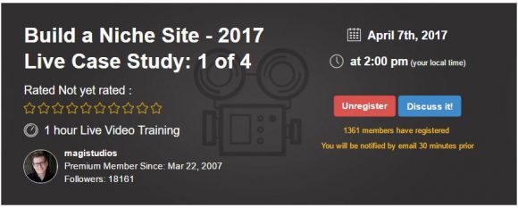
This afternoon’s weekly webinar is yet another smashing example of the epic value I derive from participation. Jay Neill of Magistudios, a 10-year WA veteran, is presenting a live session on building a niche site from scratch.
I’ll be front and center for the presentation because I invariably absorb some powerful tips from Jay’s sessions. Not a member yet? Not to worry! All webinars are recorded, and whenever you take that plunge and join us, you can watch and benefit from hundreds of previous webinars at your convenience! Now, that’s value!
Summing Up
For anyone interested in working online, information on how to create a good website for an online business is mission critical. I’m excited to share my thoughts and perspectives on basic guidelines.
Were these guidelines helpful? Please give me a shout in the comment section below. Your opinions matter and I look forward to reading them!
Do you have family or friends who are also contemplating working from home online? If you think this post may assist them, please feel free to share!
Like It? Please Share It!


Hi
Very interesting read indeed and I entirely agree that building a good website is fundamental to starting this journey.
I only wish I had learnt to do some of this stuff a long time ago.
Its quite inspirational to know you are retired and making money online too.
Thanks
Steve
Thank you, Steve. Working online really is an excellent fit for retirees in many ways and I’ve thoroughly enjoyed it! I too wish I had begun my online venture sooner. But my advice is there’s no time like the present to get started 🙂 Wealthy Affiliate offers all the tools and resources you need.
I’m on a journey myself creating a quality website. Thanks for sharing an informative post. I just started my journey in creating a website and the suggestions that you have provided are very helpful. I have been struggling to make money online for years. I’ll take what I have learned into my website. I want to make an income online as well
Hi Karlene,
I’m pleased to hear you found the post helpful. These are all useful tips I’ve gleaned from the training available through Wealthy Affiliate. They’ve served me well. I wish you every success in your online journey. I hope you’ll stick with it, learn new techniques, and most importantly take action. Thanks for stopping by!
Hi Linda
Thank you so much for sharing, I have been on this journey myself and I know just how frustrating it can be. So I will be taking your suggestions on-board and see if I can really make my website work. How long did it take you to start earning some revenue? Thanks again for the wonderful insights. Joanne
Hi Joanne,
Thanks so much for visiting my site. Building an affiliate marketing business is a process that takes time. That’s one of the first things that Wealthy Affiliate lays out on the table when you start their training. It’s not a get-rich quick scheme. I hope you will consider each of these guidelines in terms of how it might improve your site and take action rather than allowing frustration to take hold. Everyone has a difference experience but for most of us it takes months or even longer to see results. I hope you can learn to enjoy the journey as I have. Stick with it and success will build! After a year of consistent posting, I have a lot of keywords out there so that’s a big part of the equation.
Good luck!
Wow this is very well explained and I have been doing a lot of these things but I am not really sure if my theme is mobile friendly so that is something I need to look into. I find it encouraging that I don’t need to have a bunch of fancy animation. I agree that you can’t just build a site and expect people to come. There needs to be a lot of fully descriptive text on that site! This was the big thing I did not know when I first started. I had a website full of pics and videos but nothing to read!
Hi Ririj,
We do learn a lot as we build out our sites, don’t we? Thorough content crafted around keywords that our target market is searching for is essential. I do encourage you to check your site for mobile friendliness. If you’ve set up your Google Console account, you can check the Search Traffic menu in the dashboard. One of the options is Mobile Usability. Google will let you know if they’ve encountered any mobile issues. Another good site is PageInsights. This site will give you a sense of page performance and speed based on both Desktop and Mobile Access.
Good luck and thanks for engaging!
Hi, Linda.
Great information you shared with us, I used it as a check list on my blog. Starting an online business was something that I thought somehow almost impossible for me, but with people like you and a great community, my steps became easier.
About the grammar: this has been the hardest part of writing my content, especially cause English is not my first language. I guess with time and practice I will be less scared of making mistakes.
Thank you for your post.
Hi TG,
The grammar thing is hard for many of us. That’s true even if English is your first language 🙂 I definitely recommend Grammarly to increase your writing confidence. Even their free version is very good and will help you avoid some distracting errors. I was honored to read that you’ve used my post as a checklist. Stick with sound basics and you’ll do just fine! Good luck and thanks for visiting my blog!